
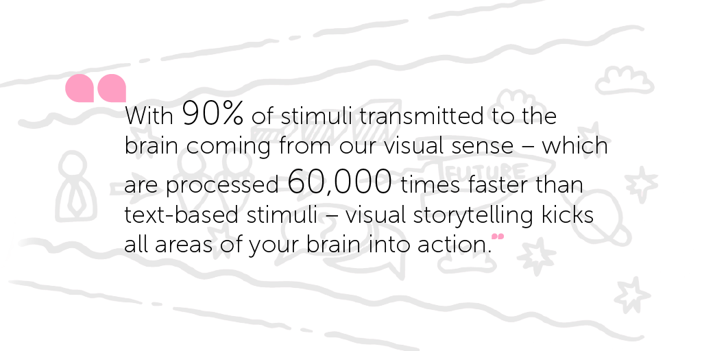
Did you know that messages communicated through the medium of storytelling can be up to 22 times more memorable than cold hard facts?
Picture this:
You’re heading into a surprise meeting organised by the senior leadership team to introduce you to the company’s bold new strategy for the next five years.
You enter the room feeling excited, full of aspiration, and eager to learn about how you can make a difference to achieving the new strategy.
You pull up a seat next to your colleagues, around a crowded table in the middle of the room.
And then you see it.
There, in plain sight – is the dreaded ‘Death by PowerPoint’ presentation.
Your heart instantly sinks to your stomach.
Bullet point after bullet point, dry fact after dry fact, and what feels like a meeting that will go on forever.
Eventually, after an agonising two hours, you leave feeling exhausted, disengaged, and overloaded with information that you find yourself really struggling to remember.
You start trying to visualise the presentation in your mind’s eye, desperately hoping this will trigger your brain to recall the important messages and content.
But it simply doesn’t happen.
So why is this?
Well, listening to long-winded, fact-filled presentations only activates certain parts of the brain’s language-processing functions – where we decode words into meaning.
As a result, some parts of the brain are left inactive and dormant. Meaning the full message struggles to get through.
But rest assured, this doesn’t have to be the end of your PowerPoint love affair.
Stories + visuals: the power-couple of 2019
Contrary to popular belief, PowerPoint presentations don’t have to be boring.
Yes, sometimes facts and information just needs to be shared. We get that.
But they’ll always have more impact if you weave them together into a coherent, powerful and immersive story.
And that’s not surprising.
We all love a good story, don’t we? Instantly feeling engaged when we hear a narrative, or equally when we’re presented with a striking visual.
You can probably instantly recall the details of your favourite childhood stories, and the images they evoke in your mind’s eye.
Stories build an emotional connection, while data and facts secure people’s trust.
As our Associate and Master Coach Jan says: stories help us make sense of the world, and dream up new worlds.
They enable us to resonate and engage with an audience on a much deeper level – both intellectually and emotionally.
But they become even more powerful when you add visual elements to the mix.
Laser-focusing your attention on the messages being communicated.
Combining both storytelling and visual elements can instantly capture attention and creates new connections in your mind, helping people to remember the most important details – as well as everything in-between.
And with today’s advanced and continuously evolving technology, visual storytelling has never been easier to put into practice.
You can capture and edit videos of employees sharing their stories on the ground with just a few swipes of your finger. Advanced creative editing apps are only a few clicks away. The democratisation of storytelling tools is spreading like wildfire.
These resources can help turn your colleagues from being zombie-like consumers of information into inspired, engaged participants in organsiational communication.
But do you know where, and how, to use storytelling in your organisation, to maximise its potential to create deeper engagement?
To support you in achieving this, some of our very own creative storytelling experts have shared their own ideas and experience as useful sources of inspiration – to help you make your visual storytelling sparkle.
Read on for some exceptional insights…
The power of storytelling through data visualisation
Holly Wilson, IC and Design Consultant
My passion for transforming data into something beautiful stems from my frustration with data- and content heavy presentations, which in my experience usually leave people feeling exhausted, confused and totally switched-off – the key message totally lost on all.
When I first started exploring the world of data visualisation, I came across the work of David McCandless, who is an absolute inspiration. I was lucky enough to attend one his conferences in London last year.
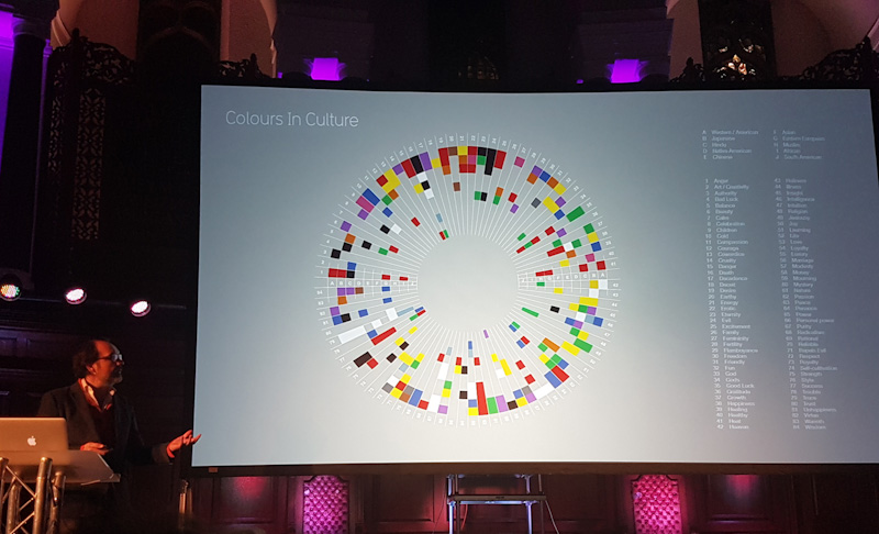
According to David, data visualisation is growing in importance because it enables knowledge compression – allowing an enormous amount of information to be packed into a small space. Utilising simplistic visualisations to bring the story to life.
To me, simplicity is key, and data visualisation makes it easier to share stories in ways which give people the visual space to appreciate key messages in a new light.
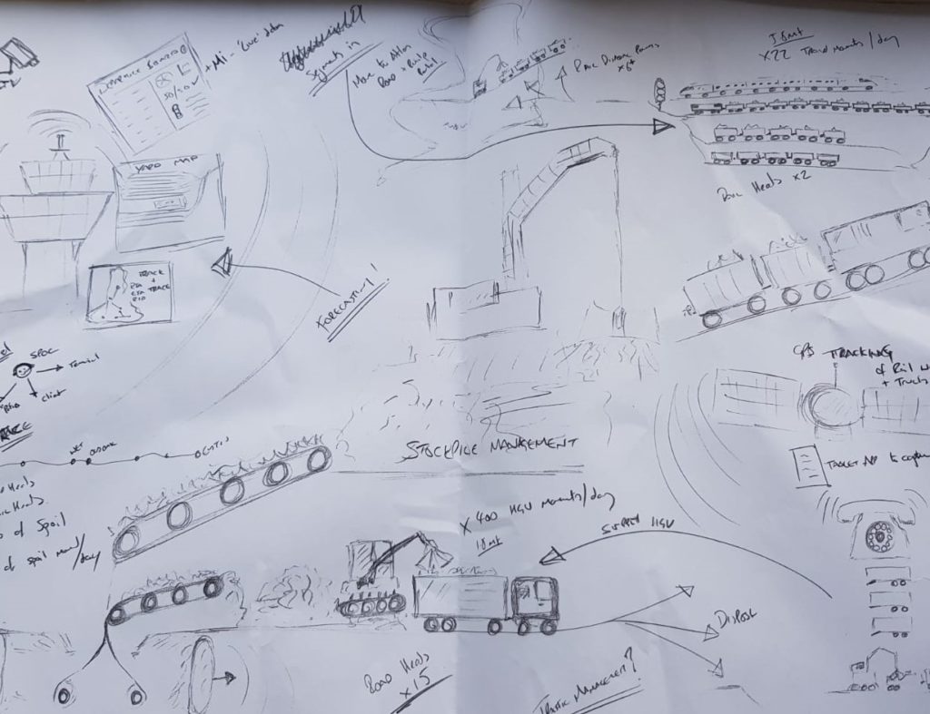
I am a huge fan of making something out of nothing – taking scribbles, doodles, excel data, and dashboard information and turning it into something that’s really visually engaging.
There’s something really exciting about digging through the chaos to find the real story, that’s desperately trying to fight its way into our minds – just like in the image below.
Storytelling through visualisation also gives people the opportunity to draw their own interpretations of what the content could mean to them, to others or to the world around them. It’s a simple yet powerful way to expand people’s imaginations… something that’s particularly hard to do when trawling through countless excel spreadsheets.
“The greatest value of a picture is when it forces us to notice what we never expected to see.”
John W. Tukey
Why not try creating your own visual story from data? Check out David’s website for inspiration. You never know, you may surprise yourself with what you come up with!
Using visual storytelling for sustainability
Kelly Blakey, Account Manager and previous in-house IC expert
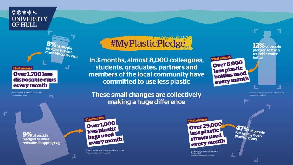
At my previous organisation, we challenged colleagues to think about their impact on the environment and take steps to be more sustainable, at work and at home.
Some colleagues got onboard straight away, while others struggled to get engaged with the project.
So to really get the message home, we decided to share the ‘story so far’ in an impactful, visual way.
We created a powerful video and a series of infographics to show the huge difference people were making as part of the scheme – including the sheer amount of single-use plastic they were saving from clogging up landfill sites.
It’s no secret that sustainability can sometimes unfortunately come across as a bit of a mundane topic. But sharing it in a visual way really helped people see how they could make a difference, and inspired them to get get involved.
Visual storytelling was really effective at demonstrating the power of people working together to achieve a common goal, as well as communicating the story of why sustainability was so important to the organisation, us as individuals, and above all, to our planet.
The impact was significant – we saw a huge increase in the number of people opting for reusable coffee cups, received a fantastic number of suggestions for how we could improve sustainability as an organisation, and witnessed a massive upswing in the number of staff members who were proudly sharing the visual materials – as well as their own sustainability stories – on their social media channels.
Without visual storytelling, I certainly don’t think we’d have been able to inspire such a strong, emotive and wide response. It really helped the message resonate with our entire audience, and made it simple and accessible for all.
Turning data into a visual narrative
Lewis Jackson, Illustrative Designer
When people think about ‘visualising data’, they tend to think of a static infographic.
Which is great if you’re looking to communicate data in a direct, easily digestible way. An infographic enables the reader to quickly and easily interact with the information – likely because around 65% of us are primarily visual learners.
But what about the story that you want to tell with that data? By structuring the information as a visual narrative, you can lead your reader down a more persuasive path to help get your message across.
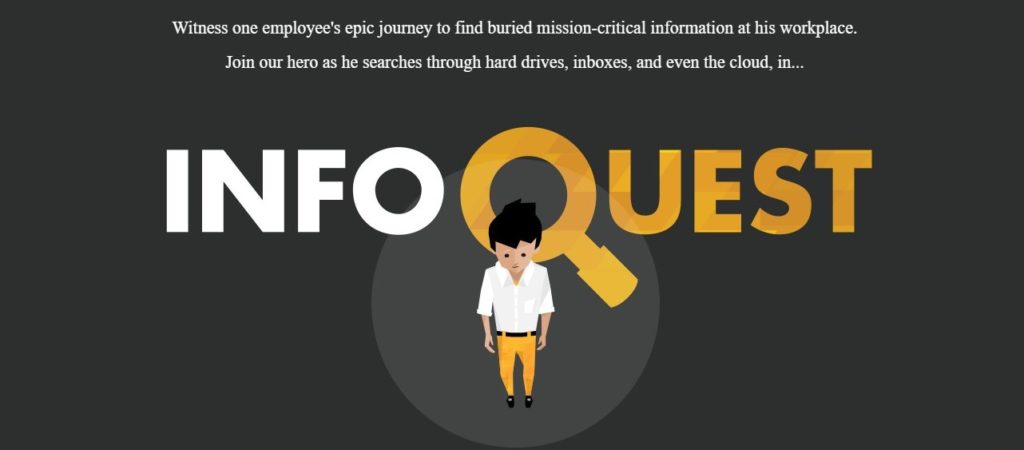
Atlassian Confluence did a marvellous job when they took the monotonous subject of ‘information management’ and created an engaging story around the benefits of keeping all your data in one place.
Just like any good story, they set the scene with a good protagonist – Chuck – who is on a mission to achieve a particular goal (in this case, to wade through mountains of disparate data and information to find business-critical insights).
By building a dynamic character into the story, they provide the reader with an instant connection to the content, and real-life scenario they can immediately relate to.
Next minute, a challenge is thrown into the mix. His boss wants the information, and pronto! You might have experienced this specific scenario at some point during your career…
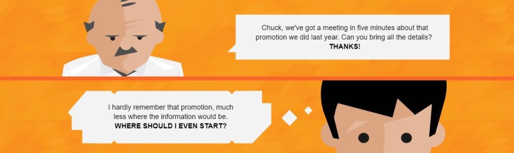
The reader then continues to follow poor old Chuck’s needle-in-a-haystack search by scrolling down the page as he tries to locate the information his inpatient boss is after.
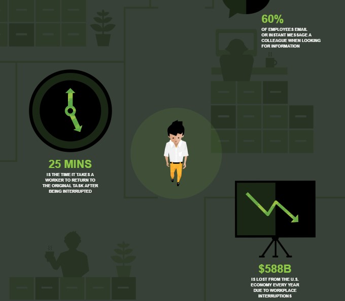
And soon enough, they are shown a series of statistics about how much time, productivity and information is lost when information is stored in lots of different places – tying the theme of the story, to the core message of the content.
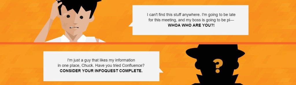
Chuck is completely lost. He doesn’t know what to do. Until suddenly, Atlassian come to the rescue, by offering a solution that enables helps people to store and organise all their information in one centralised place – so that it’s always there when they need it.
This is a classic story structure with a compelling beginning, middle and end, a relatable protagonist and conflict, and a resource that comes to the protagonist’s aid and makes them stronger than they started out. And it’s a really effective piece of marketing to boot.
Think about it – wouldn’t a story like this make you want to buy in to the messaging much, much more than if it was just communicated in a dry series of bullet points? Or even as a static infographic?
The digital age has opened up a lot of possibilities, allowing people to interact with information in a more human, emotive and inclusive way.
And visual storytelling could be the magic tool you need to really take advantage of it!
Want to get stuck into the benefits that visual storytelling could bring your organisation? Get your hands on a pack of our visually immersive storytelling cards here, or get in touch to see how our talented team could bring your communications to life.
Meet the author

The best thing about H&H is that we dig deep into how IC can really help organisations to achieve better results. We focus resolutely on the role internal comms plays in improving employee engagement, productivity and performance, and translate this understanding into IC programmes that always leave our clients beaming. That's what gets me up in the morning: because happy employees lead to equally happy customers, and at H&H I've got a unique chance to really make a difference to employees across the globe. Who wouldn't be happy about that?Speaking of communication, I'm not just adept at talking to people - I'm a trained in classical opera! When I'm not obsessing over internal comms, you'll likely find me on the road travelling around Europe, getting up close and personal with nature, or browsing supermarket aisles (don't ask - food and wine takes up a lot of my time).